Close
Many people ask me why an earlier data person, is running a brand strategy consulting firm where design is a second skin. I have always been fascinated with design.. I’ve always been drawn to patterns, colors, and the subtle details that make things stand out.
At Pegboard, building a brand from the ground up has been a fascinating journey. Witnessing countless brand identities and crafting new ones myself, I’ve observed a common misconception: design as purely artistic expression. On the other hand, some view it as simply adding colors, shapes, and fonts to presentations and charts. The truth lies somewhere in between.
It’s creativity put together with a science. Of course, it’s an art, but hey, the अर्क (essence) lies in structures you build around design. Effective brand design is a strategic science, where creativity meets structure to forge powerful connections with your audience. Yes, creativity is crucial, but it’s anchored in strategic thinking and psychological understanding. Every design decision, from color palettes to logo shapes, is carefully considered. Data, user behavior research, and how humans perceive visual information all play a role.
The magic lies in breaking down the brand design into 3 key elements – typography (fonts, sizes), colors, and shapes. This is your starting point. Here’s a simple way to break down brand design into its core elements: This approach helps you focus on one element at a time, alleviating the pressure of a “creative hat.” Everyone has a different process. This one has always worked for me.
According to the 5 personality shapes, I am a strong square. While I thrive on structures and data, my team members at work and a few close friends know what a squiggle I am.
Let’s delve deeper into each element:
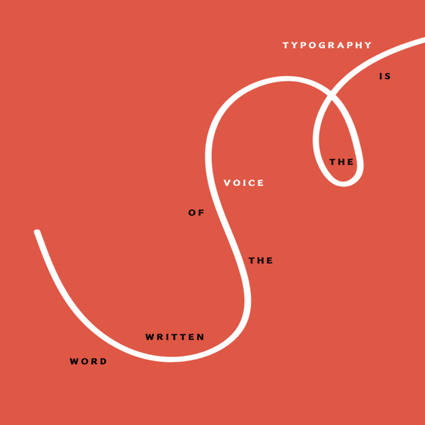
Imagine reading a financial report presented in a playful, bouncy font. It wouldn’t exactly inspire confidence, would it? Typography, the art of choosing and arranging typefaces, is essential for conveying brand personality. Serif fonts like Times New Roman exude tradition and sophistication, ideal for luxury brands. Sans-serif fonts, like Helvetica, appear clean and modern, perfect for tech companies. Even subtle details like font weight and size influence perception. A bold headline grabs attention, while lighter body text encourages easy reading. By understanding the psychology of fonts, designers can select the perfect voice to deliver the brand’s message.
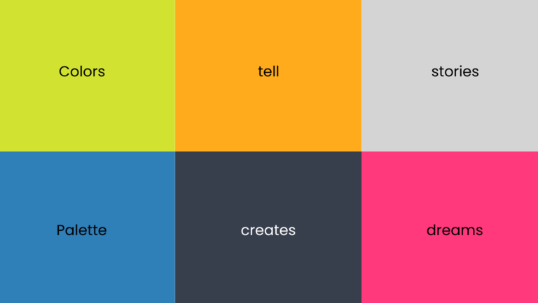
Colors are more than aesthetics; they evoke emotions and associations. Designers leverage these color associations to create a visual language that resonates with the target audience. Strategic color combinations not only grab attention but also subconsciously influence how users perceive the brand. This requires an entirely separate chain of column, but in essence, start noticing colours and what they mean to you. Play a game every time you like a movie poster, a brand logo and ask yourself how does this color make me feel. And there, you begin your understanding of colours through simple observations.
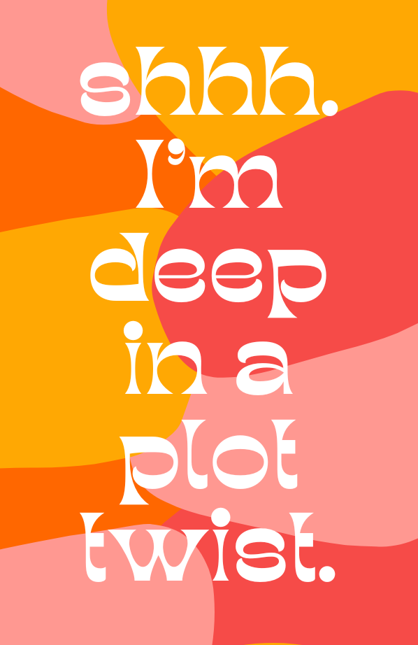
Shapes are the building blocks of design, each conveying a distinct message. Sharp angles and triangles suggest power and stability, ideal for brands promoting strength or innovation. Circles and ovals represent unity and community. Even the absence of a defined shape can be impactful. Minimalist logos with ample negative space exude sophistication and allow the brand name or symbol to take center stage. By understanding the psychology of shapes, you can create a visual identity that reinforces the brand’s core values and messaging.
Design goes beyond specific elements and thrives on structure. If you are still struggling with the 3 elements, start with alignment. Can’t go wrong there. Alignment, the arrangement of elements on a page, is crucial. Consistent left, right, or center alignment creates a sense of order and professionalism. While uneven alignment can be used strategically for dynamism, it requires intention.
There’s more to design than these core elements, including hierarchy, visual weight, and negative space. We’ll explore these in future articles.
Meanwhile, channelise your inner square or squiggle for that matter. Design isn’t limited to artistic expression. People with analytical minds can excel in it. After all, as the saying goes, “good design is good business.”
Regus, A Wing
Andheri 400059
Mumbai, India